
EVOLUTION OF PYTHON
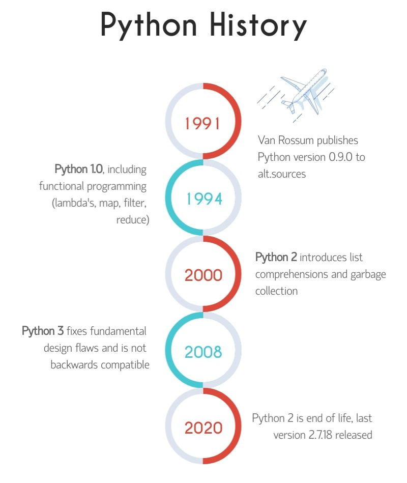
Birth (Early 1990s): Python was created by Guido van Rossum, a Dutch programmer, in the late 1980s, and its development continued into the early 1990s. It was first released to the public in 1991. This can be considered Python’s “birth” or infancy stage.
Early Childhood (1991-1994): During this phase, Python gained initial attention and started to gain popularity among early adopters. It was primarily used in academia and small-scale projects, slowly learning to crawl and take its first steps.
Adolescence (1994-2000): In this stage, Python started gaining wider recognition and acceptance within the programming community. Its simplicity, readability, and focus on code maintainability helped it stand out. The release of Python 2.0 in 2000 marked a significant milestone in its development, introducing many new features and improvements.
Adulthood (2000-2008): Python matured further during this period. Its community grew significantly, and the language continued to evolve with regular updates and enhancements. The introduction of Python 2.2 in 2001 brought garbage collection improvements and a new type hierarchy.
Full Maturity (2019-present): Python 3 eventually gained widespread adoption, and the community embraced the language’s modern version. Python’s popularity soared, driven by its versatility, extensive libraries, and its use in emerging technologies such as data science, machine learning, and web development. Python 3.8, released in 2019, introduced many new features, including assignment expressions and positional-only parameters.
VERSIONS IN PYTHON:
- Python 1.x: The initial version of Python, with several subversions released between 1991 and 1994.
- Python 2.x: The next major release series, which had various subversions and updates. Notable versions include Python 2.0 (released in 2000), Python 2.4 (2004), Python 2.7 (2010). Python 2.7 marked the end of the Python 2.x series, with its end-of-life announced for January 1, 2020.
- Python 3.x: A significant and backward-incompatible release series, aimed at improving the language’s design and addressing various shortcomings. Notable versions include Python 3.0 (2008), Python 3.4 (2014), Python 3.6 (2016), Python 3.8 (2019). Python 3.9 (2020) and Python 3.10 (2021) were released after my knowledge cutoff.
- It’s important to note that Python 2.x and Python 3.x are not fully compatible, and transitioning from Python 2 to Python 3 required adapting code and addressing differences. The Python community encouraged the adoption of Python 3.x due to its improved features and support, and Python 2.x is now considered legacy.
- Each major version release introduced new features, syntax enhancements, performance improvements, and bug fixes, aiming to make Python more powerful and efficient. The community actively supports and maintains Python 3.x, with regular updates and improvements.

SILENT FEATURES OF PYTHON
☛ Code Quality
Python code is highly readable, which makes it more reusable and maintainable. It has broad support for advanced software engineering paradigms such as object-oriented (OO) and functional programming.
☛ Developer Productivity
Python has a clean and elegant coding style. It uses an english-like syntax and is dynamically-typed. So, you never declare a variable. A simple assignment binds a name to an object of any type. Python code is significantly smaller than the equivalent C++/Java code. It implies there is less to type, limited to debug, and fewer to maintain. Unlike compiled languages, Python programs don’t need compiling and linking, which further boosts the developer’s productivity.
☛Developer Productivity
Python has a clean and elegant coding style. It uses an english-like syntax and is dynamically-typed. So, you never declare a variable. A simple assignment binds a name to an object of any type. Python code is significantly smaller than the equivalent C++/Java code. It implies there is less to type, limited to debug, and fewer to maintain. Unlike compiled languages, Python programs don’t need compiling and linking, which further boosts the developer’s productivity.
☛ Code Portability
Since Python is an interpreted language, so the interpreter has to manage the task of portability. Also, Python’s interpreter is smart enough to execute your program on different platforms to produce the same output. So, you never need to change a line in your code.
☛ Built-In And External Libraries
Python packages a large no. of the prebuilt and portable set of libraries. You can load them as and when needed to use the desired functionality.
☛ Component Integration
Some applications require interaction across different components to support the end to end workflows. Onc such component could be a Python script while others be a program written in languages like Java/C++ or any other technology.
Python has several ways to support the cross-application communication. It allows mechanisms like loading of C and C++ libraries or vice-versa, integration with Java and DotNET components, communication using COM/Silverlight, and interfacing with USB devices over serial ports. It can even exchange data over networks using protocols like SOAP, XML-RPC, and CORBA.
☛ Free To Use, Modify And Redistribute
Python is an OSS. You are free to use it, make amends in the source code, and redistribute, even for commercial interests. It is because of such openness that Python has garnered a vast community base that is continually growing and adding value.
☛ Object-Oriented From The Core
Python primarily follows the object-oriented programming (OOP) design. OOP provides an intuitive way of structuring your code, and a solid understanding of the concepts behind it can let you make the most out of your coding. With OOP, it is easy to visualize the complex problem into smaller flows by defining objects and how they correlate. And then, we can form the actual logic to make the program work.
June 2023
EVOLUTION OF DIGITAL MARKETING
Indeed, the term “Digital Marketing” was first coined in the 1990s when the internet was gaining popularity, and businesses began exploring the possibilities of marketing their products and services online. During this time, the internet was primarily a one-way platform known as Web 1.0, where users could access information but had limited opportunities for interaction and sharing.
The Web 1.0 platform provided businesses with the ability to establish an online presence through websites, but marketers were still skeptical about the effectiveness of digital marketing strategies. The lack of widespread internet adoption and limited interactivity posed challenges and uncertainties for marketers. They were unsure if their traditional marketing approaches would translate effectively to the digital platform.
In 1993, the first clickable banner went live, after which HotWired purchased a few banner ads for their advertising. This marked the beginning of the transition to the digital era of marketing. Because of this gradual shift, the year 1994 saw new technologies enter the digital marketplace. The very same year, Yahoo was launched.
Yahoo, originally known as “Jerry’s Guide to the World Wide Web,” was founded by Jerry Yang and David Filo in 1994. It quickly gained popularity as a web directory and search engine, receiving nearly 1 million hits within its first year. Yahoo’s success and the increasing number of internet users prompted significant changes in the digital marketing space.
In 1996, several other search engines and tools were launched, further expanding the options available to internet users. HotBot, LookSmart, and Alexa were among the notable additions to the search engine landscape during that time.
The year 1998 marked a significant milestone in the evolution of search engines and digital marketing. Google was founded by Larry Page and Sergey Brin, and it quickly gained traction for its efficient and accurate search results. Google’s algorithmic approach to search, PageRank, revolutionized the search engine.

Not wanting to be left behind, Microsoft shifted its focus from MSN and launched Live Search, later rebranded as Bing, as a direct competitor to Google and Yahoo in the search engine market. This further intensified the competition and led to advancements in search engine technologies and algorithms.
These developments in the late 1990s and early 2000s set the stage for the dominance of Google as the leading search engine and laid the foundation for the digital marketing landscape we see today. Search engine optimization (SEO), pay-per-click (PPC) advertising, and other digital marketing strategies continue to evolve as businesses strive to capture the attention of the growing online audience.
June 2023Creating Dynamic Pages
Create pages from a collection quickly and simply through Wix’s dynamic pages feature.
What are Dynamic Pages?
Dynamic pages in Wix provide a convenient way to create multiple pages based on a single design layout and data from a collection. Here’s how the two key components of dynamic pages, Dynamic Category Pages and Dynamic Item Pages, work together:
- Dynamic Category Page:
- A Dynamic Category Page serves as a template for displaying multiple items from a collection.
- It contains the design layout and structure that will be applied to all the items in the collection.
- This page dynamically pulls and displays the relevant information from the collection, such as images, text, and other data fields.
- It acts as a hub or container for all the items within the collection.
- Dynamic Item Page:
- A Dynamic Item Page is an individual page created for each item in the collection.
- It is automatically generated based on the design layout of the Dynamic Category Page.
- Each Dynamic Item Page represents a specific item from the collection and displays its unique information.
- These pages have their own URLs, which are automatically assigned based on the item’s data in the collection.
- Changes made to the design layout or styling on the Dynamic Category Page will be reflected on all the Dynamic Item Pages.
The benefits of using dynamic pages include:
- Automatic URL and SEO generation: Each item in the collection gets its own URL, making it easily accessible and optimized for search engines.
- Real-time updates: Any modifications made to an item in the collection will be automatically reflected on the corresponding Dynamic Item Page after refreshing the page.
- Seamless addition and deletion: If new items are added to the collection, new Dynamic Item Pages will be created automatically. Likewise, if an item is deleted from the collection, its corresponding Dynamic Item Page will also be removed.
- Consistent design across pages: Changes made to the design or layout on the Dynamic Category Page will be applied to all the Dynamic Item Pages, ensuring a consistent look and feel throughout the site.
By leveraging the power of dynamic pages, you can efficiently manage and display content from your collection, create a user-friendly browsing experience, and easily maintain consistency in design and updates across multiple pages.
Set up
Creating a dynamic page can be done through the Content Manager button.
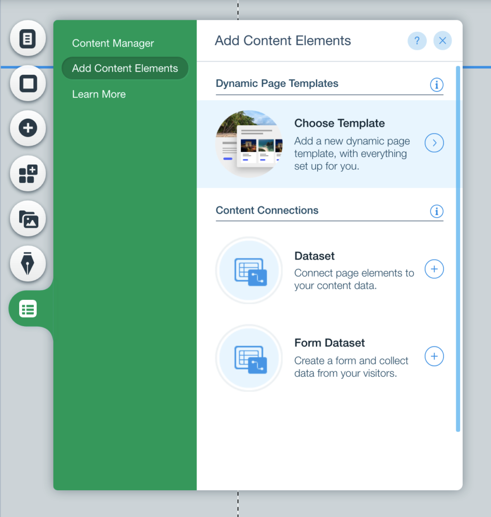
Click Add Content Elements, and Choose Template.
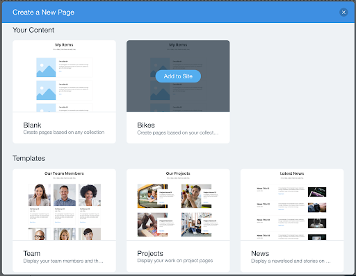
After selecting the “Create a New Page” option in the Content Manager and choosing a template for your dynamic pages, you will see the “Your Content” and “Templates” sections. Assuming you have a collection named “Bikes,” the examples below are based on that collection. Once you’ve selected the appropriate collection and Wix has finished creating the dynamic pages, you should see two new pages in your Site Structure sidebar.
Dynamic Category (All) Page
Dynamic Category (All) Page: This page represents the dynamic category page that displays all the items from your “Bikes” collection. It is the page where multiple items are shown together, typically in a grid or list format. The “All” term signifies that this page displays all the items from the collection.
Dynamic Item (Title) Page
Dynamic Item (Title) Page: This page represents an individual item from the “Bikes” collection. Each item in the collection will have its own unique page generated based on a specific field, such as the “Title” field. The dynamic item page displays detailed information about a particular item, allowing users to view more specific content.
Wrap Up
Indeed, dynamic pages in Wix provide a convenient and efficient way to showcase and manage collections on your website. By utilizing dynamic pages, you can save time and effort in creating and maintaining individual pages for each item in your collection. The automatic generation of pages based on your collection data eliminates the need for manual addition and ensures that your content stays up-to-date as you add or modify items.
The benefits of dynamic pages extend beyond time-saving. They allow you to present your collection in a cohesive and organized manner, making it easier for visitors to browse and explore the items. The consistent design and layout across dynamic pages ensure a seamless user experience.
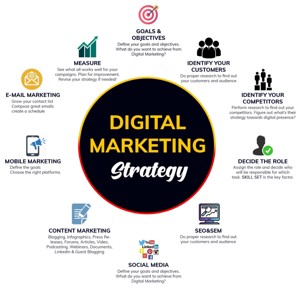
June 2023HOW DO WE GET SUCCESS IN DIGITAL MARKETING
Achieving digital marketing success requires a well-rounded and strategic approach. While the specific tactics may vary depending on your business and industry, here are some key steps to help you achieve success in digital marketing:
- Define Clear Goals: Start by establishing clear and measurable goals for your digital marketing efforts. Whether it’s increasing website traffic, generating leads, improving brand awareness, or driving conversions, having specific goals will guide your strategies and help you track progress.
- Identify and Understand Your Target Audience: Invest time in researching and understanding your target audience. Define their demographics, interests, preferences, and online behavior. This knowledge will enable you to tailor your digital marketing efforts to effectively reach and engage with your ideal
- Develop a Comprehensive Strategy: Create a holistic digital marketing strategy that aligns with your goals and target audience. Consider incorporating various channels such as content marketing, social media marketing, search engine optimization (SEO), email marketing, paid advertising, and analytics. Your strategy should outline specific tactics, timelines, and allocated resources for each channel.
- Create Compelling and Relevant Content: Content is at the heart of digital marketing success. Develop valuable, relevant, and engaging content that speaks to your target audience’s needs and interests. This could include blog posts, videos, infographics, ebooks, and more. Consistently create and distribute content across multiple channels to build brand authority and nurture customer relationships.
- Optimize for Search Engines: Implement SEO best practices to improve your website’s visibility in search engine results. Conduct keyword research, optimize on-page elements, ensure mobile-friendliness, and build high-quality backlinks. A well-optimized website will attract organic traffic and increase your chances of being discovered by potential customers.
- Leverage Social Media: Utilize social media platforms strategically to connect with your audience, share valuable content, and build brand loyalty. Engage in conversations, respond to customer inquiries, and leverage paid advertising to reach a wider audience. Regularly monitor social media analytics to gain insights and refine your social media strategy.
- Leverage Social Media: Utilize social media platforms strategically to connect with your audience, share valuable content, and build brand loyalty. Engage in conversations, respond to customer inquiries, and leverage paid advertising to reach a wider audience.
HTML: Classes vs IDs
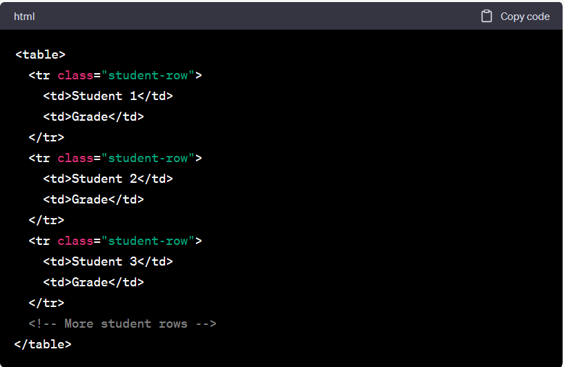
To apply certain CSS styles to multiple elements, such as rows representing students in a table, you can use classes. Here’s an example of how you can use classes to style the table rows:
HTML:
Then, to apply the CSS, we write the following in our CSS file, using the . as the CSS selector for classes:
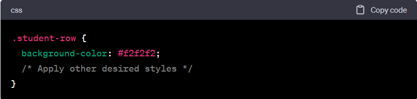
In the above example, the student-row class is added to each <tr> element representing a student in the table. The CSS selector .student-row targets all elements with the student-row class, allowing you to apply specific styles to those rows. In this case, the background color is set to #f2f2f2, but you can add any other desired styles to this class.
By using classes, you can easily target and style multiple elements with a single selector, making your CSS more efficient and maintainable.
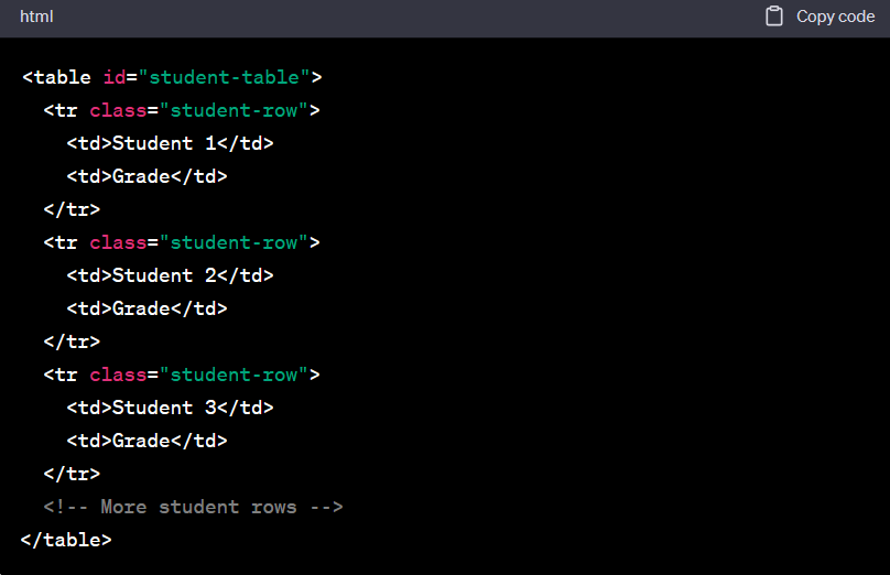
IDs
Correct, IDs are unique and can be applied to at most one element on a page. They are typically used to identify a specific element for targeted styling or JavaScript interactions. Let’s continue with the example of the table:
CSS
In the example above, we have assigned the ID “student-table” to the <table> element. The CSS selector #student-table targets the element with the specified ID, allowing you to apply specific styles to that table. Here, we’ve applied the border-collapse property to collapse the borders between table cells, but you can add any other desired styles.
Remember that IDs should be unique on a page, while classes can be used on multiple elements. IDs are typically used when you want to target and style a specific element or when you need to reference that element in JavaScript.
June 2023How SEO helps DIGITAL MARKETING?

SEO (Search Engine Optimization) plays a crucial role in digital marketing by helping businesses improve their online visibility, increase organic traffic to their websites, and ultimately drive conversions and business growth. Here’s a human-like explanation of how SEO helps digital marketing:
SEO helps digital marketing by optimizing websites and digital content to achieve better rankings in search engine results pages (SERPs). When users search for relevant keywords or phrases related to a business, SEO ensures that the website appears prominently in the search results, increasing the likelihood of attracting clicks and visitors.
By implementing various SEO techniques, such as keyword research, on-page optimization, technical optimization, and link building, businesses can enhance their website’s visibility to search engines. This optimization process helps search engines understand the website’s content and relevance, making it more likely to appear in relevant search queries.
When a website ranks higher in search results, it gains more visibility and exposure to a wider audience. This increased visibility can lead to a significant boost in organic traffic, as users are more likely to click on the top results. SEO helps businesses target the right keywords and optimize their content to attract qualified traffic that is more likely to convert into customers.
Moreover, SEO contributes to the overall user experience of a website. Optimization efforts often involve improving site speed, mobile-friendliness, and overall website usability, making it easier for visitors to navigate and engage with the website. This positive user experience not only encourages longer on-site engagement but also increases the chances of visitors returning in the future.
REFERENCE BY: https://www.techcronus.com/blog/what-is-seo-digital-maketing
June 2023Design – Color
Color plays a significant role in visual design, including web design. It has the power to convey meaning, evoke emotions, and create a memorable experience for website visitors. Just like the color of an everyday object can communicate a message, the color choices on a web page can also communicate information to users.
For instance, let’s consider the color of a stop sign, which is universally recognized as red. The choice of red for stop signs is intentional because it’s a highly noticeable and attention-grabbing color. It communicates a sense of urgency, caution, and the need to halt. Similarly, color choices on web pages can have a similar impact on users.
1.Thinking About Color
Analyzing and finding inspiration from existing web pages is an excellent way to understand color usage and gather ideas for your own designs. Here are some steps you can follow:
- Choose a favorite web page: Select a web page that you admire and find visually appealing. It can be from any industry or category.
- Observe the colors used: Pay attention to the color choices on the web page. Look at the text and its background, buttons, images, and any other elements that catch your eye. Take note of the different colors you spot.
- Assess color harmony: Evaluate whether the set of colors on the page feels cohesive and harmonious. Consider how well they go together and if they create a pleasant visual experience. Trust your instinct and personal taste while assessing color combinations.
- Focus on buttons and images: Note the colors used for buttons on the page. Assess whether they stand out or blend with the rest of the design. For images, observe how the colors within the images fit into the overall color scheme of the page.
- Inspect the CSS: Use the developer tools in your browser to inspect the CSS code for each distinctively colored element on the web page. Look for where color is defined in the CSS and note the color schemes used (RGB or HSL).
- Identify surprises or unique approaches: Consider if there are any surprising or unconventional uses of color that catch your attention. These unexpected color choices can spark new ideas or perspectives for your own designs.
- Seek inspiration from other sources: Expand your sources of inspiration beyond web pages. Explore other media like films, paintings, and print designs. Websites such as Dribbble, siteInspire, or Awwwards showcase designs created by talented individuals and can provide inspiration for color usage.
Remember, the goal is not to copy or replicate exactly what you see, but to gain insights, learn from successful color combinations, and apply them in your own unique way.
Deciding on Colors
Creating a color palette is indeed a valuable approach to ensure consistency and cohesiveness in your design project. Color rules or color harmonies provide a framework for selecting colors that work well together. Here are some commonly used color rules and how they can be applied:
- Monochromatic: This rule involves using variations of a single hue. It creates a harmonious and unified look by utilizing shades, tints, and tones of the same base color. It is a safe and straightforward approach, offering a clean and elegant aesthetic.
- Analogous: Analogous colors are hues that are adjacent to each other on the color wheel. They share similar undertones and create a sense of harmony. Using analogous colors allows for more variation while maintaining a cohesive look. It can be effective in creating a visually pleasing and balanced design.
- Complementary: Complementary colors are hues that are opposite each other on the color wheel. They create a high contrast and vibrant combination. Complementary colors can be used to draw attention, highlight important elements, or create visual impact. However, it’s important to use them in moderation to avoid overwhelming the design.
When selecting a color rule, consider the purpose of your web page, the content you want to emphasize, and the number of distinct elements you have. It’s also important to keep in mind your target audience and the mood or message you want to convey.
Online tools like Palette and Adobe Color CC can assist you in generating and exploring color palettes based on these rules. They provide options to adjust and fine-tune colors, preview how they work together, and even offer additional complementary colors.
Remember that color rules are guidelines, and you can always deviate from them based on your creative vision and specific project requirements. Experimentation and finding the right balance is key to creating a color palette that enhances your web page and communicates your desired message effectively.
Accessible Colors
Considering accessibility in web design is crucial to ensure that your website is usable and inclusive for all users, regardless of their visual abilities. Here are some tips to enhance color accessibility:
- Provide Sufficient Color Contrast: Ensure that there is enough contrast between text and background colors to make it easily readable for all users. Use tools like the Web Content Accessibility Guidelines (WCAG) to check if your color combinations meet the recommended contrast ratios.
- Avoid Color-Only Indicators: Do not rely solely on color to convey important information or instructions. Use additional visual cues such as icons, labels, or patterns to ensure that users with color vision deficiencies can understand the content.
- Test for Color Blindness: Use tools like Color Laboratory or Color Oracle to simulate different types of color blindness and evaluate how your design appears to users with visual impairments. This will help you identify any issues and make necessary adjustments to improve accessibility.
- Provide Color Alternatives: In cases where color is used to convey information, offer alternative methods such as text labels or symbols to ensure that all users can understand the content, regardless of their ability to perceive color.
- Consider Other Visual Impairments: Keep in mind that color blindness is just one aspect of visual impairments. Consider other factors like low vision, color sensitivity, and visual fatigue when choosing colors and designing your website. Providing options for adjustable text size, high contrast modes, and customizable color schemes can improve accessibility for a wider range of users.
- Stay Updated on Accessibility Guidelines: Familiarize yourself with accessibility guidelines such as WCAG 2.1 to ensure that your design meets the standards and best practices for accessibility. Regularly check for updates and new recommendations to stay informed.
By designing with accessibility in mind, you can create a more inclusive web experience for all users, accommodating a diverse range of visual abilities and ensuring that your content is easily perceivable and understandable.
Color on Web Pages
You’ve summarized the key considerations for pairing colors with elements on a web page effectively. Here’s a breakdown of the points you mentioned:
- Text Colors: Ensure readability by selecting contrasting colors for text and background. Choose a dark color for light backgrounds and a light color for dark backgrounds. This contrast helps to enhance legibility and prevent strain on the eyes.
- Consistency: Maintain visual consistency by assigning colors based on the importance and hierarchy of elements. Apply more striking or contrasting colors to highlight important elements, such as buttons or key sections. As you move down in importance, use colors from your palette that are less attention-grabbing.
- Organization by Importance: Organize elements based on their significance and assign colors accordingly. For example, if you want a specific button to stand out, give it a color that contrasts with the surrounding elements. Ensure that the color choices align with the goals and desired user interactions on the page.
- Similar Elements, Similar Colors: Elements with similar functions or belonging to the same category should share similar colors. This consistency helps users quickly understand the purpose or relationship between different elements. For example, all buttons for primary actions can have a consistent color, while links or navigation items can have a shared color to indicate their interactive nature.
By following these guidelines, you can create a visually appealing and user-friendly design that guides users’ attention and effectively communicates information on your web page. Remember to consider factors like readability, visual hierarchy, and consistency to ensure a cohesive and engaging user experience.
A Piece of the Puzzle
You’re absolutely right! Color is just one component of a holistic design approach. It should be aligned with other design elements such as font choice, sizing, positioning, layout, and overall visual hierarchy to create a cohesive and impactful design.
Here are some additional points to consider:
- Font Choice: Select fonts that complement your color palette and overall design style. Consider the readability, personality, and appropriateness of the fonts for your content. Fonts can convey different emotions and set the tone for your website, so choose them wisely.
- Sizing and Proportions: Pay attention to the size and proportions of different design elements. Ensure that text is legible, images are appropriately sized, and elements are balanced in relation to each other. Consistent sizing and proper proportions contribute to a visually pleasing and harmonious design.
- Positioning and Layout: Think about how different elements are positioned on your website. Use layout principles such as alignment, spacing, and grouping to create an organized and intuitive design. Strategic positioning can guide users’ attention and create a smooth visual flow.
- Experimentation and Iteration: Design is an iterative process, and it often involves trying out different ideas, making adjustments, and learning from the results. Don’t be afraid to experiment and explore different possibilities. Embrace the opportunity to learn from your mistakes and refine your design based on user feedback and your own insights.
Remember, design is subjective, and what works well for one website may not work for another. It’s important to understand your target audience, goals, and brand identity to create a design that resonates with your specific context. With time, practice, and an open mindset, you’ll continue to develop your design skills and create visually compelling and effective websites.
June 2023DIFFERENCE BETWEEN ONLINE MARKETING VS OFFLINE MARKETING
ONLINE MARKETING:
Overall, online marketing has become an essential component of modern business strategies, leveraging the internet and digital channels to effectively promote and expand businesses in the digital age.
The versatility and efficiency of online marketing enable businesses to tailor their strategies to specific demographics, measure campaign performance, and leverage real-time interactions with customers. This dynamic nature allows for continuous refinement and optimization of marketing efforts to achieve the desired results.
Additionally, mobile apps have become an increasingly powerful tool for businesses to engage with their customers and provide convenient access to their products or services.
SOME F THE EXAMPLES OF ONLINE MARKETING
1.Amazon
2.Yahoo
3.Filpkart
4.Twitter
5.Emails
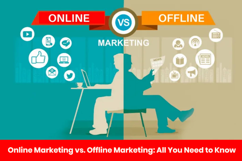
OFFLINE MARKETING:
Offline marketing refers to the traditional methods used to promote a business, product, or service in the physical world, away from digital platforms. It encompasses a range of tactics and channels that have been used for decades to reach potential customers.
One key advantage of offline marketing is its ability to create tangible experiences. Customers can physically interact with products, see demonstrations, or receive samples. This hands-on approach can leave a lasting impression and generate word-of-mouth referrals.
Overall, offline marketing tactics work in synergy with online strategies to create a comprehensive marketing plan. By combining both online and offline methods, businesses can effectively reach a diverse audience and maximize their marketing efforts.
SOME OF THE EXAMPLES OF OFFLINE MARKETING :
1.Chats
2.Pamphelets
3.Radio
4.Wall paintings
5.Posters
June 2023The Website Development Process
The following is a summary of the web development process and an introduction to commonly used languages and Content Management System (CMS) options:
1.Form a plan
Before diving into website development, it is crucial to engage with various teams and stakeholders within your organization to create a comprehensive plan. This initial planning phase sets the foundation for a successful website. Here are some important questions to consider before starting your first site draft:
What is the goal of your website? Clearly define the purpose and objectives of your website. Are you aiming to generate leads, sell products, provide information, or engage with your audience?
Who is your target audience, and what do you want them to do on your website? Understand your audience’s demographics, interests, and behaviors. Determine the specific actions or conversions you want them to take on your site, such as filling out a form or making a purchase.
What type of website are you building? Identify the specific type of website you are creating, whether it’s a basic informational site, a membership site, an online store, or a combination of different functionalities.
What content are you planning to publish, and at what volume? Define the type and quantity of content you intend to create and publish on your website. This includes text, images, videos, and other media assets.
What is the purpose of your content? Clarify the goals and objectives of the content you will be creating. Are you aiming to educate, entertain, inspire, or persuade your audience?
How will you structure your website for the best navigational experience? Consider the information architecture and navigation structure of your website. Create a logical hierarchy of pages and ensure easy navigation for users to find what they need quickly.
What is your budget? Determine the financial resources allocated for your website development project. Consider costs related to design, development, content creation, hosting, and ongoing maintenance.
2. Create a wireframe.
The initial step in creating a successful website is to establish a blueprint, often referred to as a wireframe. While it doesn’t have to be a formal document, a wireframe provides a visual representation and serves as a guide for both you and your developers. Here are some key points to consider:
Purpose and Structure: Clearly define the purpose and structure of your website. Determine the key pages and sections that will be included and how they will be organized.
Content Placement: Decide where different types of content, such as text, images, and videos, will be placed on each page. Consider the hierarchy and the visual flow of information.
Navigation: Design a clear and intuitive navigation system that enables users to easily navigate through your website. Determine the placement and style of the main menu, submenus, and any additional navigation elements.
Functionality and Interactivity: Consider the interactive elements you want to incorporate, such as forms, buttons, sliders, and other user interface components. Define their purpose and placement within the wireframe.
Responsiveness: Keep in mind the importance of responsive design. Ensure that your wireframe considers how the website will adapt and display on different devices and screen sizes.
There are various tools available to create wireframes, such as Invision, Slickplan, or Mindnode. These tools allow you to create visual representations of your website’s layout and interactions. Alternatively, you can start with a simple sketch on a whiteboard or paper.
By creating a wireframe, you provide a clear direction to your developers, align your vision with the development team, and establish a solid foundation for the design and development phases of your website project. It helps streamline the process, saving time and effort in the long run.
3. Write your website code.
When it comes to web development, the next step after planning is writing the actual code. Developers utilize various coding languages for different aspects of a website, including the front-end (client-side) and back-end (server-side) development, as well as specific functionalities and design elements.
4. Build the back-end of your website.
Indeed, web development encompasses more than just writing code. Building the back-end and front-end structures and designing the website are equally important aspects to consider. Let’s explore the process of back-end development in more detail.
The back-end of a website is responsible for handling the data and functionality that powers the front-end. It consists of two key components:
Server: The server forms the foundation of the back-end infrastructure. It can be a single computer or a network of computers that hosts and manages the website’s files, databases, and other resources. The server receives requests from users’ browsers, processes them, and sends back the appropriate responses. Common server software includes Apache and Nginx.
Database: The database is where the website stores and manages its data. It provides a structured way to organize information, such as user profiles, product catalogs, blog posts, and more. There are various types of databases used in web development, including relational databases like MySQL and PostgreSQL, and NoSQL databases like MongoDB. The choice of database depends on the specific requirements of your project.
5. Build the front-end of your website.
If you’ve ever dabbled in web design or used platforms like WordPress, Squarespace, or Google Sites, you’ve encountered front-end web development. The front-end is a crucial part of web development as it encompasses what your visitors, customers, and users see and interact with on your website. Front-end development, also known as client-side development, involves using JavaScript, HTML, and CSS.
Front-end development focuses on creating the visual and interactive elements of a website. It involves controlling components such as typography, fonts, navigation menus, layout positioning, and ensuring browser compatibility and responsiveness. The front-end development process aims to bring your initial site vision to life and align it with the wireframe you created.
6. (Optional) Work with a CMS.
Choosing a Content Management System (CMS) over coding a website “by hand” or “from scratch” offers several advantages. While using a CMS may provide less flexibility and control over the front-end, it offers numerous benefits that make it a popular choice.
7. Acquire a domain name.
Once your website is set up and hosted, it will have an IP address, which is a unique identifier for locating your website on the internet. However, to make it easier for visitors to find your site, you’ll also need a domain name. A domain name is a memorable and user-friendly website address that people can type into their browsers to access your site.
8. Launch your site.
After setting up your domain name and connecting it to your hosting provider, you’re getting closer to launching your website. However, before making it officially live, there are a few important steps you should take to ensure a successful launch. Here are some key considerations:
Team Responsibilities: Assign clear roles and responsibilities to your team members. Determine who will handle tasks such as content creation, design updates, maintenance, and ongoing website management.
Thorough Testing: Test your website extensively to identify and resolve any issues or glitches. Check for compatibility across different browsers and devices to ensure a consistent user experience. Test all functionalities, forms, links, and navigation elements to ensure they are working correctly.
SEO Optimization: Optimize your website for search engines to improve its visibility and attract organic traffic. Conduct keyword research, optimize meta tags, headings, and content, and ensure your website follows SEO best practices. Consider implementing a sitemap and submitting it to search engines.
Final Check: Perform a final review of your website before the launch. Double-check all content for accuracy, proofread for spelling and grammatical errors, and verify that all images and media files are properly displayed. Test all forms and contact information to ensure they are capturing data correctly.
Making Your Site Live: Once you are confident that everything is in order, it’s time to “flip the switch” and make your website live. Ensure that your hosting settings are properly configured, your domain name is correctly linked, and any necessary security measures are in place.
By following these steps and conducting a thorough pre-launch checklist, you can ensure that your website is ready to go live and provide a positive user experience from day one.
June 2023How To Design A Website
While you can customize your website to fit your unique needs or suit your style, there are specific actions that anyone who wants to design a website must take. Follow carefully to find out how to design a website, from defining your website’s purpose to choosing a website designing platform, designing the architecture, filling in necessary content and launching your website.
Sample Website

1. Define the Site’s Purpose
It involves clearly identifying the main objective or goals that your website aims to achieve. By understanding the purpose of your website, you can make informed decisions and create a design that effectively communicates your message to your target audience.
2. Choose Your Platform
Website builders offer user-friendly interfaces and customizable templates that can be tailored to your specific needs. Some website builders are even specialized for particular purposes, such as e-commerce, blogs, or portfolios. This allows you to choose a website builder that aligns with your intended goals and functionalities.
3. Gather Your Brand Elements
When designing your website, it’s important to consider your brand’s identity and create a cohesive visual experience. Here are some tips for selecting colors, fonts, and images:
Color Scheme: Choose a color scheme that reflects your brand and evokes the desired emotions. Start with a primary color that represents your brand identity and then select one or two complementary colors to enhance the overall look. Consider the psychological associations of colors and how they align with your brand values.
Typography: Select fonts that align with your brand’s personality and enhance readability. Different font styles convey different messages. Serif fonts can convey formality and authority, while sans-serif fonts often give a more modern and clean impression. Script fonts are ideal for conveying creativity and elegance.
Images: Incorporate relevant and high-quality images that capture the attention of your users. Use images that align with your brand’s message and evoke the desired emotions. Avoid generic stock photos and opt for unique visuals that represent your brand’s identity. Make sure the images are properly optimized for web use to ensure faster loading times.
4. Select a Template or Theme
After defining your website’s purpose and considering the design elements, the next step is to choose a theme or template. A theme determines the layout and appearance of your website, including the placement of images, text, and buttons.
Most website building platforms offer a variety of pre-designed templates that cater to different industries or website types. These templates come with built-in features relevant to specific purposes. Take the time to preview and explore the available templates to choose the one that best aligns with your website’s content and goals.
5. Map Out Your Site
Mapping out your site is an essential step in the website design process as it provides a visual guide for organizing your content and determining the structure of your website. Here are some steps to help you map out your site effectively Identify the Main Pages, Establish Page Hierarchy, Determine the hierarchy of your pages and how they will be linked together.
6. Design Each Site Element
Once you have your template or theme and website map in place, it’s time to start designing each element of your site. Here are some key elements to consider and their importance in structuring your website and improving user experience Menu, Header and Footer, Search Bar
7. Customize Your Web Pages
Regardless of your site’s purpose, there are certain web pages that are essential for almost every website.
- Home Page
- Product or Service Page
- About Page
- Blog Page
- Contact Page
8. Test and Launch Your Website
Before your site goes live, test loading time, content readability, linking and mobile responsiveness, contact form and any other element that can affect user experience. Have family members and colleagues give their feedback about your website’s design. If there are no issues, go ahead and publish your site.
Also, keep updating your website based on its performance, trends and current business operations.
9. Optimize Your Content
Optimizing your website after its launch is essential for ensuring a smooth user experience and improving its visibility in search engine results. Here are some key areas to focus on:
Mobile Responsiveness: While most website templates are designed to be mobile-responsive, it’s still important to test your website on different devices and browsers to ensure it displays correctly. Consider using mobile emulators or testing tools to ensure a seamless experience across various devices.
Internet Linking: Internal linking is crucial for user navigation and search engine optimization. Use hyperlinks to connect relevant pages within your website, providing users with easy access to related content. This helps improve user engagement and signals to search engines that your website provides valuable information.
Media Optimization: Optimize your media files, such as images and videos, to enhance website performance.
Search Engine Optimization (SEO): Implement basic SEO practices to improve your website’s visibility in search engine results. This includes optimizing page titles, meta descriptions, heading tags, and URL structures to include relevant keywords. Add alt text to images to improve accessibility and provide search engines with context.
User Experience Monitoring: Continuously monitor user behaviour on your website using analytics tools like Google Analytics.
June 2023